

The invitation arrived for
the Kips Bay Decorator Show House Opening Night Reception; it’s doorway graphic
seemed to not only whisper a warm Gotham welcome but to arouse a twinkling design-fantasy curiosity about a secret world to be explored just past that portal.
the Kips Bay Decorator Show House Opening Night Reception; it’s doorway graphic
seemed to not only whisper a warm Gotham welcome but to arouse a twinkling design-fantasy curiosity about a secret world to be explored just past that portal.
The Decorator Show House is
not like falling through the rabbit hole despite boasting Bunny Williams as
the Show House Chairman — sorry, I mean no disrespect; chalk it up to irresistible
sweet bunny-rabbit springtime thoughts – plus it’s also the second time I’ve run
into this icon of design in less than two weeks…
not like falling through the rabbit hole despite boasting Bunny Williams as
the Show House Chairman — sorry, I mean no disrespect; chalk it up to irresistible
sweet bunny-rabbit springtime thoughts – plus it’s also the second time I’ve run
into this icon of design in less than two weeks…
And to continue the
reference – the show truly showcases the magic of the decorative artists pulling a rabbit out of the hat.
reference – the show truly showcases the magic of the decorative artists pulling a rabbit out of the hat.
They make beauty and utility look like two sides of the same coin.
The astonishing
compositions wrought by the creative interior designers, artists, and
architects will render you gobsmacked and thinking you’ve stepped into a dream
worthy of a Hollywood set.
compositions wrought by the creative interior designers, artists, and
architects will render you gobsmacked and thinking you’ve stepped into a dream
worthy of a Hollywood set.
The press preview Sneak
Peek was scheduled Wednesday afternoon and despite torrents of rain that would
make any hostess forgive you for cancelling plans – the attendance at the show
was rather brisk, confirming that New Yorkers are made of strong mettle.
Peek was scheduled Wednesday afternoon and despite torrents of rain that would
make any hostess forgive you for cancelling plans – the attendance at the show
was rather brisk, confirming that New Yorkers are made of strong mettle.
And Metal – of the
precious, metallic and industrial sort – turned out to be a theme spotted
throughout a majority of the decorative art installations.
precious, metallic and industrial sort – turned out to be a theme spotted
throughout a majority of the decorative art installations.
Glamorous gold
Regal silver
Coveted Copper
Stainless Steel — and more.
Hmmm… Surely the designers
didn’t all get a memo about the use of these spectrum altering surface
materials.
didn’t all get a memo about the use of these spectrum altering surface
materials.
I asked every designer who
featured the metals and while most didn’t have a quick reference or answer as
to why, Rachel Martin, the confident, knowledgeable director of marketing for Matthew Quinn’s (www.matthew-Quinn.com)
dramatic Show House Kitchen that flaunted a palette of mixed metals from brass
to polished nickel, explained the metal inspiration came to Quinn from the
building’s industrial feel.
Bingo! Go to the head of
the class – or brass, as the case may be!.
the class – or brass, as the case may be!.
While initially the
cover-girl glamour of the mansion makes the industrial reference rather
oblique, the pedigree of the now landmarked buildings helps explain.
cover-girl glamour of the mansion makes the industrial reference rather
oblique, the pedigree of the now landmarked buildings helps explain.
The Villard
Mansion, home to this year’s Show House, was built by railroad magnate,
HenryVillard, as a series of townhouses in the early 1880’s at the height of
the Industrial Revolution.
Mansion, home to this year’s Show House, was built by railroad magnate,
HenryVillard, as a series of townhouses in the early 1880’s at the height of
the Industrial Revolution.
Today, the McKim, Mead &
White-designed Villard mansion that looks like an Italian palazzo is a perfect
locale for the Kip’s Bay Decorator Show House.
White-designed Villard mansion that looks like an Italian palazzo is a perfect
locale for the Kip’s Bay Decorator Show House.
In fact, you can
“double-dip” and make it a truly spectacular visit by making
reservations to dine at the Villard Michel Richard restaurant, located across
the twinkling courtyard in the Palace Hotel, all owned by Northwood Investors.
“double-dip” and make it a truly spectacular visit by making
reservations to dine at the Villard Michel Richard restaurant, located across
the twinkling courtyard in the Palace Hotel, all owned by Northwood Investors.
I wrote a restaurant review
when the iconic — and impish — chef Michel opened his restaurant here: http://www.examiner.com/review/villard-michel-richard-restaurant-review?no_cache=1398955630
when the iconic — and impish — chef Michel opened his restaurant here: http://www.examiner.com/review/villard-michel-richard-restaurant-review?no_cache=1398955630
divine, doesn’t it?
You can float throughout
the three floors of 22 inspired room designs, shop in the decorators’ Kips Bay pop
up and then sashay over to Villard Michel Richard or Pomme Palais and thanks to
moi and the Magrino team, you can enjoy 15% off throughout the duration of the
Kips Bay Show House, including Mother’s Day.
the three floors of 22 inspired room designs, shop in the decorators’ Kips Bay pop
up and then sashay over to Villard Michel Richard or Pomme Palais and thanks to
moi and the Magrino team, you can enjoy 15% off throughout the duration of the
Kips Bay Show House, including Mother’s Day.
I’ll tell you about the
cooking class with the huggable Chef Michel, later.
cooking class with the huggable Chef Michel, later.
Devine Design
Stepping into the Villard
Mansion’s decorator rooms, I was especially taken aback to see the
transformation from the drab meeting space where The New York Botanical Garden
had held it’s annual fall lecture series when it was the Urban Center — and
surprising — given the lackluster look of the place, the Architectural
League.
Surely, this was magic.
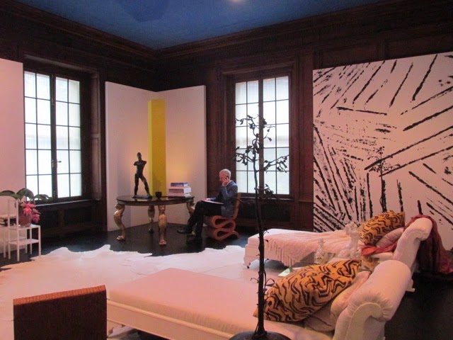
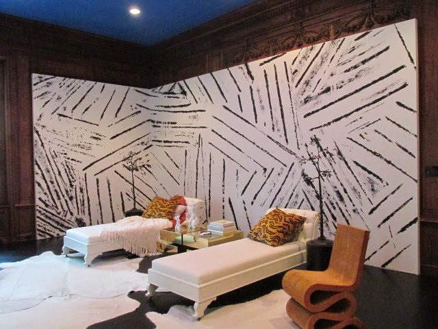
Juan Montoya was the
first room I entered – a habit to turn left into the lecture room, I guess.
first room I entered – a habit to turn left into the lecture room, I guess.
The scale of this room is
HUGE: with an almost 16 foot ceiling– it is the biggest room in the show.
HUGE: with an almost 16 foot ceiling– it is the biggest room in the show.
The polished stainless steel desk is 12 feet
and the double-sided, undulating sofa is also 16 feet.
and the double-sided, undulating sofa is also 16 feet.
Titled, “Untitled,” (why go
there?) Montoya’s rep explained the Columbian designer wanted to play with
proportion and scale; most of the artwork on display is Montoya’s own.
there?) Montoya’s rep explained the Columbian designer wanted to play with
proportion and scale; most of the artwork on display is Montoya’s own.
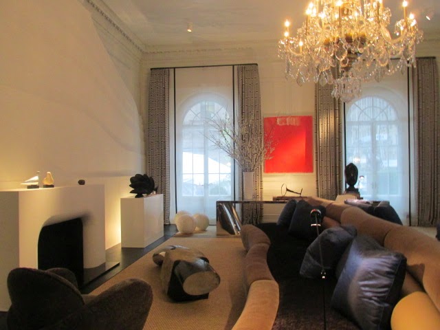

He pointed out the sinuous sculpture by Olga de Amaral, the Bogota-based textile artist.
http://www.olgadeamaral.com
Check out the gold splash page on her web
site!
site!
Yikes, it’s dramatic. (And I couldn’t agree more about the quality of a
rock…) Perusing her web site is like a trip to a gallery or museum.
rock…) Perusing her web site is like a trip to a gallery or museum.
I loved the black and white
tones of the Montoya room, especially as seen in the giant, artwork made of
resin hanging on the Madison Avenue wall between the two windows.
tones of the Montoya room, especially as seen in the giant, artwork made of
resin hanging on the Madison Avenue wall between the two windows.

My dear interior designer friend, Toni Sabatino –
and a big fan of my book, The Hamptons & Long Island Homegrown
Cookbook – Toni has a tradition of placing an autographed copy of the Homegrown book in her completed, heart-of-the-home kitchen designs as a value add for her clients! http://www.houzz.com/pro/tonisab/toni-sabatino
and a big fan of my book, The Hamptons & Long Island Homegrown
Cookbook – Toni has a tradition of placing an autographed copy of the Homegrown book in her completed, heart-of-the-home kitchen designs as a value add for her clients! http://www.houzz.com/pro/tonisab/toni-sabatino
Toni suggested I look up designer John
Douglass Eason at the show (she was headed to the Sunshine State) and then,
just like that, I turned to the majestic staircase and there he was, holding
court, explaining his dramatic use of the space.
Douglass Eason at the show (she was headed to the Sunshine State) and then,
just like that, I turned to the majestic staircase and there he was, holding
court, explaining his dramatic use of the space.
The expansive, two-leveled walls are
hand-painted brush strokes laden with Benjamin Moore metallic color.
hand-painted brush strokes laden with Benjamin Moore metallic color.
John showed how he and his artisans came up with
the pattern design and then blew it up to scale.
the pattern design and then blew it up to scale.
It’s a gorgeous work of art unto itself – equal
parts wallpaper, trompe l’oeil, and fresco.
parts wallpaper, trompe l’oeil, and fresco.
It’s not polite to stare, so look up to the eye-catching,
sting-ray sized gold chandelier by Ingo Mauer, (A German lighting designer with
a showroom in SoHo http://www.ingo-maurer.com/en/info/showrooms/new-york
sting-ray sized gold chandelier by Ingo Mauer, (A German lighting designer with
a showroom in SoHo http://www.ingo-maurer.com/en/info/showrooms/new-york

I can see why Toni recommended John. I liked him tout suite – right off the color
wheel.
wheel.
His genuine smile and courtesy a product of his
Texas upbringing, I learned in short order.
Texas upbringing, I learned in short order.
Those Southern manners are also what helped land
him that Mauer, gold-leaf chandelier.
him that Mauer, gold-leaf chandelier.
He explained she told him that she “Doesn’t loan
out.”
out.”
Yet, we see how this turned out…
Clients must love his persuasive and charming
style.
style.
John said he determined to participate in this
year’s Decorator Show to raise his profile in the design community.
year’s Decorator Show to raise his profile in the design community.
With his soaring vision on display, his is a
name that will be on design aficionado’s lips from Dallas to Dumbo.
name that will be on design aficionado’s lips from Dallas to Dumbo.
I wanted to go straight away to my sweet-pea Swiss
school friend’s brother’s installation: Edward Lobrano.
school friend’s brother’s installation: Edward Lobrano.

To get to his third-floor bedroom design, I had
to walk up two flights of stairs.
to walk up two flights of stairs.
Don’t think this is any ol’ “stairway to
heaven,” though.
heaven,” though.
I thank the artisanal Brooklyn goddesses that
the decorative painter Robin Sacks (www.robinsacksnyc.com) stopped me to
say hello, and point out her work here.
the decorative painter Robin Sacks (www.robinsacksnyc.com) stopped me to
say hello, and point out her work here.

Her two levels of graphic art are colored in black and grey
tones.
tones.
Sacks explained the faux finish
glaze, use of greys, blues, beiges and two sultry metallic: pewter and
silver.
glaze, use of greys, blues, beiges and two sultry metallic: pewter and
silver.
“I wanted to transition the
colors from a neutral to the industrial metallic so that it ‘disappears’.”
colors from a neutral to the industrial metallic so that it ‘disappears’.”
Pouf.
More alchemy.
More alchemy.
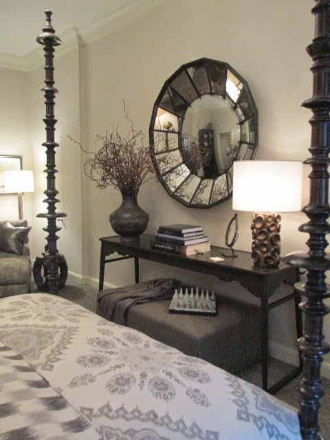
Reaching the third floor and entering the Edward D. Lobrano (Edward@edwardlobrano.com
designed bedroom was like stepping into serenity.
designed bedroom was like stepping into serenity.
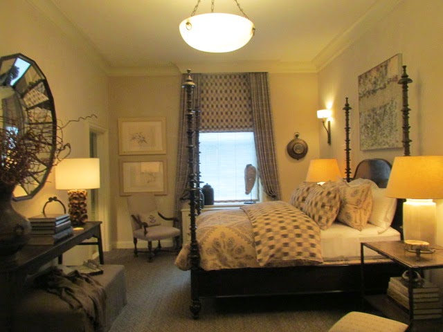
If all this recent talk of mindfulness has you
scratching your head about what it all means, you will be instantly and
spiritually transported to the essence of increased joy, reduced stress;
mysticism.
scratching your head about what it all means, you will be instantly and
spiritually transported to the essence of increased joy, reduced stress;
mysticism.
At the same time, it will take everything out of
you Not to jump headlong onto the pouf coverlet of the room’s four-poster bed, like
Maria in the Sound of Music.
you Not to jump headlong onto the pouf coverlet of the room’s four-poster bed, like
Maria in the Sound of Music.
Indeed, taking in the earthy colors, textures,
scale, proportion, and form, you will be humming “these are a few of my
favorite things,” too.
scale, proportion, and form, you will be humming “these are a few of my
favorite things,” too.

The chocolate brown wood in the bed, armoire,
and an alligator crackled wood table top; the beige slipper chair and ottoman,
along with the anchor accessories, including a fusion of Asian sculpture,
African masks, alabaster chandelier and marble chess set are enriching details
that combine to create a textured ambiance that you can readily see yourself living in.
Sadly, Edward was not there when I was touring. I missed the maestro of design.
Before leaving, I couldn’t help take some shots
of the framed photos, and sent them to my school friend, Jennifer, Edward’s
sister, hoping there was more to the narrative.
of the framed photos, and sent them to my school friend, Jennifer, Edward’s
sister, hoping there was more to the narrative.
I was not disappointed.
Jennifer gleefully wrote back that indeed, the
photos are of their mother and Edward and his dog Spencer, saying of her
mother: “We miss the grand ol’ Dame, she was a classic.”
photos are of their mother and Edward and his dog Spencer, saying of her
mother: “We miss the grand ol’ Dame, she was a classic.”
And I can’t think of a better way to
characterize the room’s look; it too is a classic. With a bit of its whimsical
personality winking back at you…
characterize the room’s look; it too is a classic. With a bit of its whimsical
personality winking back at you…
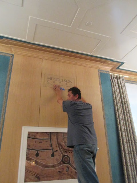
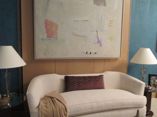
Designer Gideon Mendelson, the Mendelson Group (www.mendelsongroup.com) is a natural
born storyteller.
born storyteller.
His smooth as glass, Alistair Cooke delivery
is more “masterful” than fairy tale.
is more “masterful” than fairy tale.
After all, his installation is called, “The
Lady’s Lair.”
Lady’s Lair.”
And don’t even think this is about some damsel in
distress.
distress.
No.
Gideon says his imaginary client shouldn’t
be underestimated; she runs her household and her own company. “She’s an
organized hostess, a reliable friend and an involved parent. And, sometimes,
she needs a break,” he offers.
be underestimated; she runs her household and her own company. “She’s an
organized hostess, a reliable friend and an involved parent. And, sometimes,
she needs a break,” he offers.
Gideon’s design gives her a sanctuary that is
bold, assertive, and comforting – in grand style.
bold, assertive, and comforting – in grand style.
Even while workers were installing a few last-minute items, Gideon never broke his cool.
He enthralled me with his tale of “The Lady”
while pointing out the rich materials, furnishings, and color palette.
while pointing out the rich materials, furnishings, and color palette.
Who doesn’t love a story about a strong,
successful woman?
successful woman?
He uses the narrative – and the client’s
personality – to weave a tale of intrigue and haute design.
personality – to weave a tale of intrigue and haute design.
He described the contrast and pull of the
feminine and masculine sides of “The Lady.”
feminine and masculine sides of “The Lady.”
I tossed in a good quotable for him that he immediately made his own:
“tension.”
“tension.”
As in the tension between the two worlds of
masculine and feminine, right brain/left brain, the ying to our yang…
masculine and feminine, right brain/left brain, the ying to our yang…
I don’t know what side of mine fell for the wall
covering but I LOVE the teal-colored ultra suede walls by Phillip Jeffries www.phillipjeffries.com .
covering but I LOVE the teal-colored ultra suede walls by Phillip Jeffries www.phillipjeffries.com .
It is glamorous, sensual and something you can
pet with abandon!
pet with abandon!

The oak paneling sets it off like a cocktail ring and its
show-stopping gem placed just so… As does the patterned ceiling-as-baguette.
show-stopping gem placed just so… As does the patterned ceiling-as-baguette.
The wall trim is made of hand woven burlap. It’s a subtle accessory that adds so much. www.samualandsons.com

Gideon explained the space he started with was
altogether raw – irregularly shaped, and small.
altogether raw – irregularly shaped, and small.
So it’s all the more remarkable to learn that
not only is this his first Kips Bay show, and that he whipped out the design in
about five weeks, but to see that the space is now filled with at least five
distinct areas: work desk, a personal assistant work station, a conference or
dining table, a sitting area, and “time-out” area in front of a fireplace.
Soft leather colored in lavender — bordering on
cherry blossom pink (www.jerrypair.com) –
cover the Italian, Paula Buffa conference table chairs tip the scales to feminine
luxury.
cherry blossom pink (www.jerrypair.com) –
cover the Italian, Paula Buffa conference table chairs tip the scales to feminine
luxury.

The chairs’ glam gams only adds
to the pretty girl look.
to the pretty girl look.
Gideon describes their angles and curves while
caressing the cherry wood chair back.
caressing the cherry wood chair back.

Speaking of curves, there is an artful
collection of busts gracing the bar’s glass shelves.
collection of busts gracing the bar’s glass shelves.

And I do mean busts in the literal sense – as in
T&A…
T&A…
There is even a Joan from Mad Men mannequin bust – with all her, ahem, “assets,” on display!

And the original “Babe” — Barbie — is the
artful Welcome mat at “The Lady’s Lair” installation — the creation of
feminist artist, Shirley Klinghoffer. (www.shirleyklinghoffer.com )
artful Welcome mat at “The Lady’s Lair” installation — the creation of
feminist artist, Shirley Klinghoffer. (www.shirleyklinghoffer.com )
Now located in Santa Fe, Klinghoffer’s work is
featured in the Elizabeth A. Sackler Center for Feminist Art at the Brooklyn Museum.
featured in the Elizabeth A. Sackler Center for Feminist Art at the Brooklyn Museum.
Designer Gideon borrowed the Barbie mat from one of his clients.
Gideon pulled out the black rubber mat for me,
saying, “People either loved or hated Barbie…”
I said my feelings ran both ways.
saying, “People either loved or hated Barbie…”
I said my feelings ran both ways.
There’s that tension again.
“I had
rather a love-hate relationship with my Barbie doll,” I demurred.
rather a love-hate relationship with my Barbie doll,” I demurred.
But it’s all love with this conversation piece
of a welcome mat cum art.
of a welcome mat cum art.

Be warned: Don’t even think of calling Barbie a “door mat!”
More art that inspired Gideon is the Geo Ponti
curvy bull he pulled off the display, ordering me to “Hold it.”
curvy bull he pulled off the display, ordering me to “Hold it.”

While the bull sculpture was all smooth,
curvy lines, it possessed heft. “See,
it’s like ‘The Lady” — it packs a punch,” he said.
curvy lines, it possessed heft. “See,
it’s like ‘The Lady” — it packs a punch,” he said.

There is also the tension between the geometric – the
floor is a perspective-altering chevron pattern and the curvilinear shape of
furniture.
floor is a perspective-altering chevron pattern and the curvilinear shape of
furniture.

The settee is a sensuously curved Gideon design;
the mirror topped 40’s era cocktail tables are antique.

As I think you can see, “the Lady’s Lair” captured my heart.
Until I turned to the next installation and then
I fell in love again.
I’m weak.
The Villalobos Desio (www.villalobosdesio.com) designed
space is nothing short of breathtaking.
space is nothing short of breathtaking.
The teeny, tiny room is practically a dollhouse,
surely meant for a Hobbit.
surely meant for a Hobbit.
Or a typical New Yorker.
If anyone ever says they don’t have the space
for true design, pull out the images of this decorative art home design.
for true design, pull out the images of this decorative art home design.
I am particularly attracted to design solutions that overcome situations and challenges. With discerning aplomb.
The designer described the myriad design
challenges besides the closet-sized room (8 x 12’): the need to cover the
electrical panel boxes, no window.
challenges besides the closet-sized room (8 x 12’): the need to cover the
electrical panel boxes, no window.
The result is it’s all moody and dark. And mysterious.
And oh so much more.
The inspiration was the Studiolo Renaissance
room at the Metropolitan Museum of Art, the transporting, diminutive Studiolo, from the Ducal Palace in Siena.
room at the Metropolitan Museum of Art, the transporting, diminutive Studiolo, from the Ducal Palace in Siena.
The designers perhaps were further
influenced by the Villard’s Italian Palazzo pedigree.
influenced by the Villard’s Italian Palazzo pedigree.
So too with this room.
Seems counterintuitive, however, it works.
The designer explained that the objects occupy
or help lead the eye in this “Cabinet of Curiosities.”
or help lead the eye in this “Cabinet of Curiosities.”

The room’s reflective surfaces are a study in
elegant solutions. Unlike the Studiolo’s intarsia walls, here the
walls and floors are infused with reflective surfaces.
elegant solutions. Unlike the Studiolo’s intarsia walls, here the
walls and floors are infused with reflective surfaces.
The ceiling is cork with gold leaf.
It looks
like a star-filled night sky.
like a star-filled night sky.

The walls are shimmering silk, playing with the light and shadow.
The lighting is a mix of soft spot fixtures and LED
strung inside baffles and a chair rail that were created to wrap the room at unconventional
height levels.
strung inside baffles and a chair rail that were created to wrap the room at unconventional
height levels.
That element is truly worth noting for future
design work.
design work.
And then there is the transcending light art: an H.A.
Isle French illumination available at Etos www.etosnyc.com
Isle French illumination available at Etos www.etosnyc.com

Alexa Hampton, Mark Hampton, LLC (www.markhampton.com) who was celebrating
her birthday yesterday, is a doll.
her birthday yesterday, is a doll.
I
attended an Architectural Digest Home Design Show panel she participated in, moderated by AD editor, Margaret Russell.
attended an Architectural Digest Home Design Show panel she participated in, moderated by AD editor, Margaret Russell.
She is witty, classy, and exuberant.
I guess it’s safe to say that about her designs,
too.
too.

Alexa’s room looked like it was inspired by the “pink
city” of Jaipur.
city” of Jaipur.
As was the room designed by Markham Roberts.
Theme two.
Hampton’s room was charged with the bold colors
of an Indian wedding sari: fuchsia, indigo blue and punchy, happy, tiered paper
chandelier, a sisal wall to wall carpet, lots of pattern on pattern tiles, and
I’m “crazy for paisley” chairs.
of an Indian wedding sari: fuchsia, indigo blue and punchy, happy, tiered paper
chandelier, a sisal wall to wall carpet, lots of pattern on pattern tiles, and
I’m “crazy for paisley” chairs.
The window treatments made me think of the romance
of the Taj Mahal.
of the Taj Mahal.

The third floor hallway transition area is not to be overlooked.
The Brooklyn-based firm Span Architecture showcases a geometric, or algebraic, patterned rug infused with
sparkly Lurex along with clean, modernistic copper lined oak box seats — no, not the Brooklyn Nets kind — rather for pausing in this salon space.
sparkly Lurex along with clean, modernistic copper lined oak box seats — no, not the Brooklyn Nets kind — rather for pausing in this salon space.

The idea of salon as Span sees it, is a
“gathering of people in the home of an interesting host, and assembly of inspiring
art and ideas and a meeting space to debate art, design…”
“gathering of people in the home of an interesting host, and assembly of inspiring
art and ideas and a meeting space to debate art, design…”
Nice.
The custom benches, fabricated by Philadelphia’s
Amuneal are said to be made of sustainable wood. www.span-ny.com
Amuneal are said to be made of sustainable wood. www.span-ny.com
The gold-dust fairies worked overtime in the room
designed by Carrier and Company.
designed by Carrier and Company.
The
couple utilized the precious metal in subtle and sophisticated ways: with gold-stacked
tables,
couple utilized the precious metal in subtle and sophisticated ways: with gold-stacked
tables,

gold-flecked marble walls.

The mirror over the mantel looked like a
gold ink splot.
gold ink splot.

An animal throw covered
a polished gold-toned daybed perched in front of the fireplace that was filled
with gold tree branches.
a polished gold-toned daybed perched in front of the fireplace that was filled
with gold tree branches.
The bookshelves
were filled not with books, rather gold square planters and green grass.
were filled not with books, rather gold square planters and green grass.
The agate stone side table from Matthew Studios
was fancy and a precious accent.
was fancy and a precious accent.
I must
get one of these.
get one of these.

Carrier and Company’s husband
and wife team www.carrierandcompany.com
work with some of the city’s top style and design celebrities, including
Vogue’s Anna Wintour, Bob Pittman, Jason Wu and Jay Fielden on town and country
interior designs.
and wife team www.carrierandcompany.com
work with some of the city’s top style and design celebrities, including
Vogue’s Anna Wintour, Bob Pittman, Jason Wu and Jay Fielden on town and country
interior designs.
The Markham
Roberts composition was another favorite highlight of the Kips Bay Decorator
Show House. www.markhamrobers.com
Roberts composition was another favorite highlight of the Kips Bay Decorator
Show House. www.markhamrobers.com
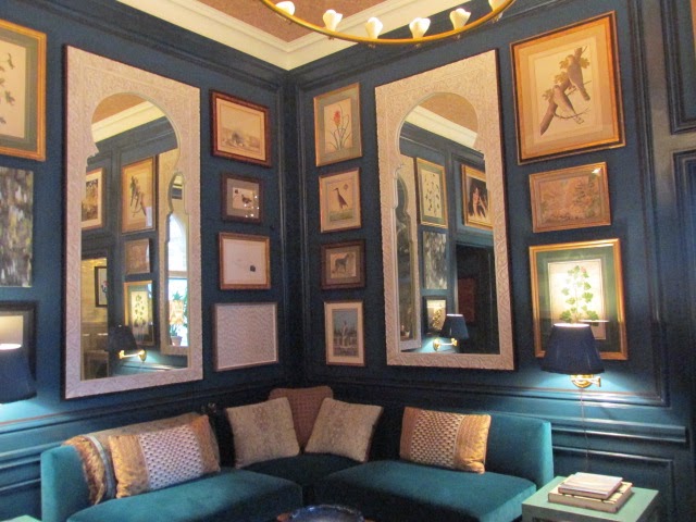
This Indian-themed or inspired room was a rich, layered, earthy look: tiger upholstered chair and floor treatment, peacock blue
walls punctuated by oversized white mirrors with rounded arches, surrounded by
framed horticultural and animal prints, grosgrain ribbon bordering the
moldings, and a dark, exotic cocktail table elaborately crafted from a tree.
walls punctuated by oversized white mirrors with rounded arches, surrounded by
framed horticultural and animal prints, grosgrain ribbon bordering the
moldings, and a dark, exotic cocktail table elaborately crafted from a tree.
The marble-topped bar was sided by white tusks that
I trust are imitation ivory.
I trust are imitation ivory.
The gold lamp looks like so many swirling
nuggets.
nuggets.

This library was surprisingly book-free. Not a
tome or Dewey Decimal system or tome or two, could I see.
tome or Dewey Decimal system or tome or two, could I see.
Still, the warm tones and bar made this room one you’ll like and want to
spend time in.
spend time in.
The White Room was a stark contrast to the other
rainbow saturated ones. Darryl Carter designed the cool, artic white room, laced with
hints of grey, and contrasting rough-hewn woods and a dark wall hanging.
rainbow saturated ones. Darryl Carter designed the cool, artic white room, laced with
hints of grey, and contrasting rough-hewn woods and a dark wall hanging.

The space looked not unlike a stage-crafted set
for an Ingmar Bergman film. Austere yet
dignified.
for an Ingmar Bergman film. Austere yet
dignified.

I liked the large daybed perched in front of the
fireplace, the console table, and the humorous mouth gags painted on the
portraits.
fireplace, the console table, and the humorous mouth gags painted on the
portraits.

The Kitchen
Curious that there was only one kitchen in the
Decorator Show House.
Decorator Show House.
But then, with the massive space and
extraordinary design details of the Matthew Quinn installation, it’s “one and
done.”
extraordinary design details of the Matthew Quinn installation, it’s “one and
done.”
This “heart of the home” kitchen and the
scullery is all you’ll need.
scullery is all you’ll need.
Quinn is a kitchen, bath, and product designer.
With obvious pride and delight, the company’s
previously noted marking guru, Rachel Martin, skillfully took me on a tour of this culinary opus.
previously noted marking guru, Rachel Martin, skillfully took me on a tour of this culinary opus.
Quinn’s attention to detail while creating a broad sweep of space that has to not only look good but serve an oft-used functionality
will leave you deeply impressed.
will leave you deeply impressed.
Now I felt like I was in the land of Gulliver’s
Travels.
Travels.
The room is 20 feet by 25 feet with a 13-foot
ceiling.
ceiling.
The windows are grand, too, coming in at about 11 feet.

I was curious about the arresting window valances.

As I stepped closer for inspection, Martin tells
me they are custom-made brass pipes that have the look and feel of a pipe
organ.
me they are custom-made brass pipes that have the look and feel of a pipe
organ.
Really?
Before I can absorb why these handsome window
treatments should have anything to do with an organ, Martin has already waved
me over to the floor-to-ceiling, custom-made 10-foot cabinets, stopping only to
point out the quatrefoil front glass design.
treatments should have anything to do with an organ, Martin has already waved
me over to the floor-to-ceiling, custom-made 10-foot cabinets, stopping only to
point out the quatrefoil front glass design.
“See where Quinn’s inspiration came from?” she
asks while laying out an arm,Vanna White-style, beyond to the Madison
Avenue-facing window.
asks while laying out an arm,Vanna White-style, beyond to the Madison
Avenue-facing window.
“Not really,” I gulp.
“Well,” she starts to explain.
“Before that
scaffolding and building scrim went up over at St. Patrick’s, Matthew
stood here looking across the street to the parapets and quatrefoils of the
cathedral.”
scaffolding and building scrim went up over at St. Patrick’s, Matthew
stood here looking across the street to the parapets and quatrefoils of the
cathedral.”
“Brilliant,” I exclaim, grateful for the clarity.
I love inspiration stories.
And this one can lay claim to what can only be characterized as “divine inspiration.”
I’m all in now.
The cabinets have a brass inlay table top, and custom draw pulls.

Everything here is custom so I’ll stop saying
that.
that.
“It’s all about the detail,” Marin trills, adding, “And function, function.”
Besides the Industrial Revolution-inspired use
of metal material used here for the show: Martin says Matthew often mixes metals.
of metal material used here for the show: Martin says Matthew often mixes metals.
Witness, the brass chandeliers, polished nickel faucets, stainless steel
cabinets – all skillfully interpreted as part of the complete look.
cabinets – all skillfully interpreted as part of the complete look.

An “aha” moment was discovering one of the
designer’s signature elements: corner end sinks on both sides of the island.
designer’s signature elements: corner end sinks on both sides of the island.
The corner sinks allow easy access for more than
one and is a real conversation spot, too.
one and is a real conversation spot, too.
Given this design consideration, now you can just look across at your
cooking cutie.
cooking cutie.


The island itself is from Silastone (www.silestoneusa.com)
The Helix
countertop design looks not unlike a good Roquefort cheese – and the finish
feels like suede, Martin tells me.
countertop design looks not unlike a good Roquefort cheese – and the finish
feels like suede, Martin tells me.
Soon,
we are both petting and rubbing the countertop.
we are both petting and rubbing the countertop.
Ahem.
Time to check out the hood oven.
This is BIG!

I learn it is made from limestone and crushed
marble with brass straps.
marble with brass straps.
It’s like a Volkswagen Beetle over the stovetop.
Seriously, it’s a very gorgeous hood.
The Dacor refrigerator is a 48” side by
side. Nice enough.
side. Nice enough.

But the added design genius I discover is the extra panel Matthew provided to give the room balance.
Cabinets sit on either side of the refrigerator
designed with pin doors that open and slide in to create a breakfast nook on
one side and reveal a wine station on the other side.
designed with pin doors that open and slide in to create a breakfast nook on
one side and reveal a wine station on the other side.

I learned Dacor is the only one to make a
residential wine station.
residential wine station.

This one is stocked with wine from Bouchaine
Vineyards.
Vineyards.
Martin’s husband works for Bouchaine.
I love wine.
I love Carneros.
I can see Rachel loves her husband – so a “shout out: was in
order, don’t you think?
order, don’t you think?

The kitchen’s walls are big subway tiles in a glamorous, greenish hue.
Whew.
Just when you think you’re all kitchened out – there’s the scullery.

It’s a sweet room off the kitchen; the custom
cabinets there are painted in a glossy, dark Benjamin Moore paint (I did this
in my former kitchen and I love the glamour).
cabinets there are painted in a glossy, dark Benjamin Moore paint (I did this
in my former kitchen and I love the glamour).
There is an herb garden filling the extra
casement space in the window and I’m stealing this design idea as soon as I
post this news.
casement space in the window and I’m stealing this design idea as soon as I
post this news.


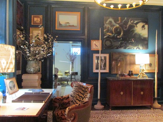
The last highlight is from Ingrao. (www.ingrao.com)
Tony Ingrao and Randy Kempner have created a signature statement in the 40-foot space on
the first floor.
Tony Ingrao and Randy Kempner have created a signature statement in the 40-foot space on
the first floor.

The 17-foot chenille sofa snakes its way through
the middle of the room, anchoring the space, as does a fabulous resin and metal
table they designed; inspired by leaves.
the middle of the room, anchoring the space, as does a fabulous resin and metal
table they designed; inspired by leaves.

The fire screen chair-inspired installation at
the back end of the room is something out of a futuristic movie – or perhaps a
slinky on drugs.
the back end of the room is something out of a futuristic movie – or perhaps a
slinky on drugs.
The Ron Arad fire screen with a video of a fire
burning inside was made for an Ingrao client in Aspen but then things changed.
burning inside was made for an Ingrao client in Aspen but then things changed.
Wow, I hate to cancel a nail appointment. I
can’t imagine the designers’ response to this change of art heart.
can’t imagine the designers’ response to this change of art heart.

If you like the fire screen – you can take it home for
something a little north of a million.
something a little north of a million.
On the more modest budget scale, you can Google the Yule log and watch a fire www.theyulelog.com
Another big highlight in the room is the Jeff
Zimmerman chandelier.
Zimmerman chandelier.
A white, frothy organic decorative art piece, it looks not
unlike an undulating jellyfish.
unlike an undulating jellyfish.
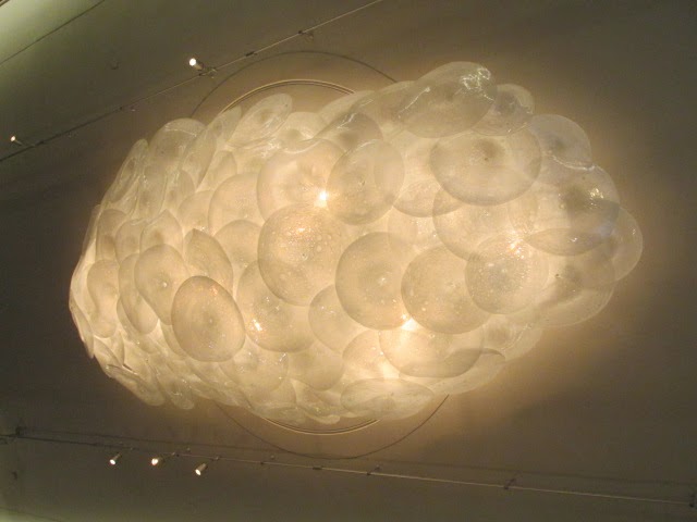
Simply gorgeous.
The walls here are combed plaster.

The look is
fantastic and can be produced at a fairly reasonable cost.
fantastic and can be produced at a fairly reasonable cost.
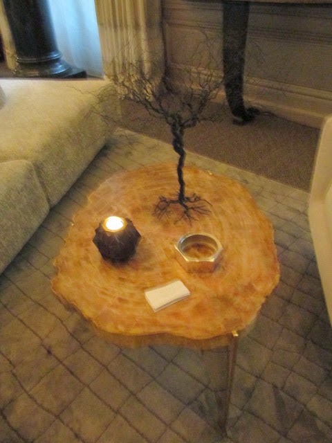
A petrified wood table here looks like a semi
precious jewel – which after all, it is… This beauty is from East Hampton
artist, Mark Wilson.
precious jewel – which after all, it is… This beauty is from East Hampton
artist, Mark Wilson.
The rug is a beauty too, designed from Doris
Leslie Blau www.dorisleslieblau.com Its cool, grey, geometric pattern would work in a
variety of rooms.
Leslie Blau www.dorisleslieblau.com Its cool, grey, geometric pattern would work in a
variety of rooms.
Every designer provides cards, literature and a Sherpa, who will guide you through the designs and furnishings.
This is a must-see experience for anyone interested in dialing up their passion for the decorative arts.
The show runs from May 1 through May 29, 2014.
For more information, go to www.KipsBayDecoratorShowhouse.org
for tickets.
for tickets.
Make your reservations at Villard Michel
Richard.
Richard.
Chef and the restaurant have
created a lovely Mother’s Day brunch, too.
created a lovely Mother’s Day brunch, too.


2 Comments
As a landscape enthusiast I am always searching for unusual European garden ornaments. One of my trips led me to the country side of Italy where I fell in love with the natural feel of its gardens. I came back to the US and was trying to find a company which would offer me the same sensation as I had experienced Tuscany. A friend told me about Authentic Provence, the moment I stepped into their showroom I was taken aback in awe. Their exquisite collection of French and Italian antiques were exactly what I was looking for to complement my garden. Now my garden is the show piece, through Authentic Provence's unique garden ornaments. I am now encompassed by the true Tuscan lifestyle. Visit them at http://www.authenticprovence.com and you will find what you are seeking.
Thank you so much, Vivian. Molto Grazie. I adore that part of the world too – Tuscany is god's country… I will have to check out Authentic Provence – I think I met them at an Architectural Digest show – is that possible? I also love Barbara Israel and on a slightly different track: Pennoyer & Newman.
I love to read your garden is a show piece & Tuscan lifestyle — please send/share a photo or two?? Merci.